
Mobile-first websites are thoughtfully crafted to offer users a seamless and user-friendly experience. This entails ensuring that the same information available on larger screens, such as laptops or personal computers, is equally accessible on smaller screens, like smartphones. Given the widespread ownership of smartphones, mobile web marketing has transitioned from being a mere option to becoming an absolute necessity.
This article offers valuable insights on creating a successful and highly effective mobile-friendly website. These tips are designed to enhance the engagement and user experience on your mobile-friendly websites. Crafting a mobile-first website goes beyond just the technical steps; it’s also about incorporating the right elements to make it an enticing destination for your audience.
Discovering the Tips for a Mobile-Friendly Website
Simply having a website accessible on mobile devices doesn’t automatically qualify it as a mobile-friendly one. To truly enhance your website and make it more engaging for visitors and potential customers, website owners should pay attention to these additional details. It’s crucial to consider users’ comfort, preferences, and convenience. By doing so, you’ll not only receive positive feedback but also ensure a better overall user experience on your website.
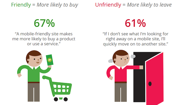
72% of consumers want mobile-friendly websites. So website owners should carefully assess their website before making it available on the web. One of the major advantages of having a mobile-friendly website is the likelihood of promoting and selling their products better.
Meanwhile, here’s the tips you need to apply to your website:
Be Responsive
Website owners must prioritize having a responsive website, ensuring that it displays effectively on smaller devices without compromising quality. Additionally, fast loading times are crucial for an efficient user experience. Perhaps, it’s time for owners to carefully establish their mobile marketing strategy in order for it to thrive well as a mobile web marketing approach.
Should Be Available for One-Handed Operation
In today’s fast-paced world, where users often have demanding responsibilities and are frequently on the move, it’s essential for website owners to prioritize one-handed operation. Designing websites for single-handed use enhances the convenience and accessibility of the user experience, accommodating individuals with busy lifestyles who rely on one-handed interaction.
Keep the Design Simple
You’ve got it right. Maintaining a minimalist design for your website enhances user comprehension. Furthermore, an excess of complex features can hinder your website’s loading speed. When incorporating images, prioritize those with smaller file sizes to ensure a faster and more time-efficient user experience on the page.
Keep Your Content Short and Sweet
When creating content for your website, it’s crucial for website owners to keep it concise and engaging. Opt for shorter, impactful messages that can capture users’ interest effectively. Lengthy content often leads to boredom and might prompt users to leave the website.
Readable Typography
When adding content to your website, ensure that your words and phrases are easily legible. This practice aids users in comprehending your website with ease, sparing them from struggling with small text and perplexing details. By implementing this approach, you not only enhance user experience but also save users valuable time, contributing to a more positive overall customer experience.
Optimized Images
Visual content plays a pivotal role in enhancing the engagement of your website. Optimized images are instrumental in achieving faster loading times, reducing data consumption, and enhancing overall performance. Yet, there are key considerations for successfully implementing these images. Website owners must ensure they adhere to best practices to bolster this aspect and cultivate an improved customer experience and successful mobile web marketing. It’s important to bear in mind that images are often the initial attention-grabbers, potentially leading to conversions or purchases.
Make It Touch-Friendly
Your mobile-first website gains enhanced appeal when it incorporates touch-friendly buttons. This feature promotes inclusivity, benefiting a diverse audience, including individuals with disabilities. Touch-friendly buttons not only prevent accidental clicks, reducing user frustration, but also contribute to maximizing overall customer satisfaction.
In Summary
Many entrepreneurs who are just starting out are eager to grow their businesses by tapping into the online market and reaching a wider audience. An essential first step in this journey is to establish an online presence through mobile web marketing. Today, a large portion of the population is highly active on the internet. Consequently, online shopping, inquiries, and various activities are now predominantly conducted through online channels.
Consequently, many website owners have taken proactive steps to enhance the efficiency and mobile-friendliness of their websites. For website and business owners, it’s essential to continuously evaluate what our customers desire and the essential elements required to create ideal platforms for them. Overall, these tips are guaranteed to address any deficiencies in your website and elevate its overall quality.