
As technology continues to advance, the vast majority of people now own smartphones. This widespread ownership has significantly simplified their everyday activities, transactions, and concerns. Consequently, optimizing your website for mobile devices is crucial for attracting more visitors and enhancing the overall user experience. Creating a mobile-first website provides users with convenient access to your business or website, enhancing search engine rankings and overall customer satisfaction. The use of the mobile marketing approach is pivotal in reaching a broader audience and staying adaptable in the face of evolving technological trends.
Understanding Mobile Design
Mobile design is the art of adeptly crafting digital interfaces, user experiences, and visual components, tailored specifically for mobile devices, such as smartphones and tablets. The primary goal is to provide users with a comprehensive and user-friendly experience, allowing them to effortlessly access the businesses and services they desire solely through their smartphones.
Here are important things to consider on mobile designing:
- Responsive Design
- Performance Optimization
- Typography and Readability
- Cross-Platform Compatibility
- Mobile accessibility
- Testing and Iteration
- Mobile Navigation
- User Experience (UX)
Enhancing User Experience on Smartphones
Source: bankmycell
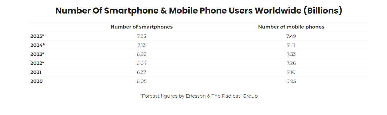
In 2023, the number of smartphone users in the world today reached 6.92 Billion, which translates to 85.82% of the world’s population owning a smartphone. Consequently, a growing number of websites have incorporated mobile-friendly features, and adopting a mobile-first approach offers a myriad of advantages that can significantly benefit your website.
These are the following advantages you can expect from mobile-first websites:
Information On-the-Go
In today’s digital age, users greatly appreciate the ease of accessing a wealth of information with just a few taps on their devices. This convenient and time-efficient way of conducting research online has not only streamlined the process but also spurred prompt action. As a result, users increasingly gravitate towards these convenient mobile methods.
Conversely, if you aspire to grow your business and attract potential customers, it’s worthwhile to delve into mobile marketing strategies. This approach empowers you to effectively manage and enhance your website, all while offering users the simplest means to access your site.
Improved SEO
You may be aware of Google’s emphasis on prioritizing mobile-friendly websites. Such websites receive preferential treatment in search engine rankings. In contrast, websites that aren’t optimized for mobile devices may not achieve as high a ranking in search engine results pages (SERPs) as their mobile-friendly counterparts.
Location-Based Services
Numerous mobile-friendly websites have harnessed the power of location services to elevate the customer experience. This entails delivering personalized, location-specific content and services, affording users a convenient snapshot of the products accessible within their proximity. In fact, 80% of consumers are willing to share their location data with apps that provide a valuable service.
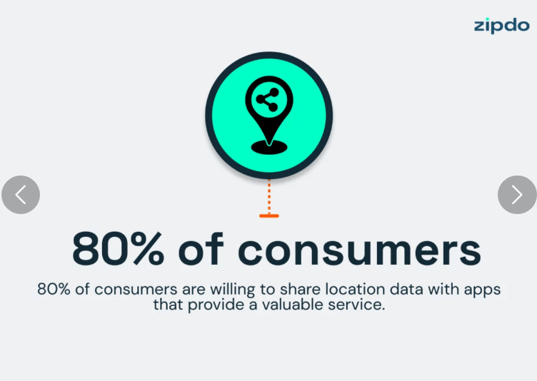
Source: Zipdo
For those new to the concept, it’s vital to grasp the significance of location-based mobile marketing. Before integrating this strategy into your website, users should have a clear understanding of how it operates and the reasons for its implementation.
Improved Conversion Rates Through Positive Mobile Experiences
A mobile-friendly website significantly boosts conversion rates by providing users with an exceptional customer experience. This positive experience not only encourages users to sign up for services, make purchases, and submit inquiries but also plays a central role in enhancing overall user engagement. With the help of mobile marketing experience, it ensures a seamless and satisfying customer journey.
Adapting to Technological Trends
With the ongoing evolution of technology, an increasing number of users have come to depend on their mobile devices for shopping and accessing essential information. Implementing a mobile-first approach ensures that websites are in sync with this shifting behavior, making them attractive to a broad audience.
Meanwhile, let’s briefly explore how changing user preferences influence the necessity of mobile-first websites:
- Mobile-Centric Lifestyles
- Seamless Multichannel Experience
- Preference for Apps
- Voice Search and AI
Integrating these elements into your website is crucial to enhance users’ experiences and help them achieve their goals more effectively. For instance, voice search simplifies the process of finding desired items by allowing users to search using only their voice. These aforementioned factors collectively contribute to elevating your website to a high standard, making it engaging and attractive to your audience.
Implementation Challenges of Mobile-First Websites
Conversely, the implementation of this feature also brings about a series of challenges and constraints. While it may be viewed as a convenience by most mobile users, it can, in reality, pose a formidable challenge for website owners, content creators, and designers. It necessitates meticulous planning and intricate maintenance to ensure its continued functionality. These are the customary challenges encountered in the development of mobile-first websites.
Limited Screen Real Estate
Mobile devices, by their very nature, are compact, resulting in constrained screen real estate. This limitation means there’s limited space for presenting essential content, including vital visual details that users need to access. In light of this, website owners should give precedence to crafting a straightforward design that accommodates comprehensive content.
Responsive Design Complexity
Responsive design undeniably plays a pivotal role in creating mobile-friendly websites. However, the process of implementing this feature is more complex than one might assume. Website owners must ensure that the design seamlessly adapts to varying screen sizes and orientations. Simultaneously, achieving the right resolution demands intricate coding and thorough testing.
Navigation and User Experience
Crafting a smooth and intuitive user experience involves employing intricate methodologies. This encompasses navigating complex website structures, which can present challenges. It’s important to bear in mind that mobile users exhibit diverse interaction patterns, relying on touch gestures instead of the traditional mouse clicks commonly associated with personal computers and laptops. Prioritizing touch-friendly design through a mobile marketing approach is crucial in this context.
Performance Optimization
Mobile-first websites demand comprehensive performance optimization. Slow-loading websites can lead to elevated bounce rates, adversely impacting search engine rankings and user experience. The crucial techniques for optimization include image optimization, minimizing HTTP requests, and reducing code bloat. While these methods are highly important, implementing them can be a challenging task.
Wrapping Up
As we conclude, it’s crucial to emphasize the importance of ensuring that websites are accessible on mobile devices. This accessibility expands their reach to a broader audience and provides users with a comprehensive view of the products and services offered. In today’s digital landscape, where smartphone usage has become the norm for daily needs, the mobile marketing adaptation through mobile-first websites is more essential than ever.